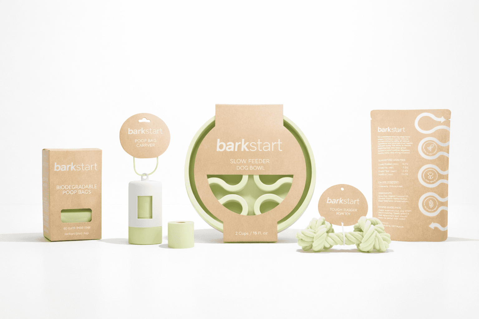
Barkstart

BarkStart is a brand developed as part of a class project focused on building a complete visual system from concept to application. The project explores how strong branding can extend across multiple packaging designs to create consistency and recognition.

BarkStart is a brand developed as part of a class project focused on building a complete visual system from concept to application. The project explores how strong branding can extend across multiple packaging designs to create consistency and recognition.

BarkStart is a brand developed as part of a class project focused on building a complete visual system from concept to application. The project explores how strong branding can extend across multiple packaging designs to create consistency and recognition.

SERVICE

Packaging Design & Brand Identity

MY ROLE

Graphic Designer

CLIENT

School Project

School Project

School Project

A dark glass bottle with a pump sits on a stone, surrounded by green leaves and textured background.

The Objective

The goal of this project was to create a cohesive identity for a fictional brand that reflects both personality and purpose. BarkStart was designed for the sustainability-conscious, millennial dog mom—someone who values products that are functional, stylish, and environmentally responsible.

A dropper is releasing a drop of liquid into a dark glass bottle, with a soft green background.

The Process

The project began with defining BarkStart’s brand values and visual direction, centered on sustainability, warmth, and approachability. I developed a full visual identity—including a wordmark, pictorial logo, color palette, and typography system—and created 3D packaging mockups to show how the brand could live consistently across multiple products.